Wednesday, 24 November 2010

The making of the film magazine front cover.

first part of the magazine i took the film poster's image and title as i wanted both of the advertistings to look simalir so people recognise the, quickly. Then i used the douge tool to lioghts the parts where i wanted the title and texts to go so they could be readble.


Secondly i took the title,logo and barcode to the top part of the page as there the most imporat and should be seen first. I also made a little headline to go assicatated with the magazine and that would go onto every issue and cover. This says 'First horror film magazine' This shows that the company are orginal and also tells you the genre of the magazine and the audience.


to add too the cover to make it more intresting i put other artical titiles in the same font as the title to ive the audeince som,ething eles to read though there samll as we want them to foucs more the the main artical which is our film
lastly i added a few images image to give it a little colour and other dimention to the cover. I feel that you mostly focus on the image of the film and the title which is what we wanted to advertise but also there are other parts in there aswell so its not so plain and not realistic.

Film magzine front cover.

With a front cover of a film magzine it can advertise your film but a huge amont including all the other promo work. Its import to make sure that you film looks as good as i can on advertsiting as that sort of promo such as bus stop posters ect can give your film the bost that it needs.
When it came to title names for the magzine i thought it would be better to use my own name instead of a currently film magazine. So we came up with theses names.


titles names :
  • Report
  • Snap
  • Action
  • Media
  • Angle


The reason i chose the word report was because the title can show that its reporting on every angle of the film industry from film making to reviews. The title font was used to look like an old fashioned type writer to go with the title and i felt it looks boring in jsut black so i made the R red to stand out and i feel it goes really well.


I wanted a logo to go with the title of the magazine because i could use this on diffrent parts of the magazine and people will regosize the logo and asicitcate it with the magzine. The logo is an old fashioned film and stand for the simple reason as the magazine is about films.


Wednesday, 17 November 2010

Making film poster


For the image i was going to go out and take pictures of the characters but i thought i would be better if we keept the story line and characters a mistrey to the audeince so i took a picture from my photography AS and edited it so it was black and white which i thought was a good idea for the theme of the film. then i used the dodge tool to blur out and lighten parts of the photo where the writing would be so it looks readble.
As the trailer has a miseriouse pram in it i thought that it would be good if i took a photo of the pram and made it smaller and blend in with the background. This will give the poster a diffrent element for the audience to think about which will entise them to watch the film.


Again in the trailer there is a protaganist. We dont see the killers face but only his actions so i didnt want to put a picture of the killers face on show or what he looks like so i decided to make a silotette of a man on paint and trasfer it onto photoshop. With this image it could look like two things : The attacker or the victim so again there is another elemnt to the poster thats gives the audience a chance to think about the film and who is the person running.


All film posters have small writting at the bottom of every poster. This is all for legal reasons so there is alot of logos and company names at the bottom including some other names. By doing the font so small it still keep within there legal rights but also doesnt destract the eye from the main picture. The caption at the top gives the audience an idea of the genre of the film so i thought that this would be a good way of shwoing this as the word death is linked to most horror films. With the way the font goes and how it was readble i place the caption over the area i dogde tolled earlyer so it was readble and got the font lettering from a website @dafont.com@ where i copy and pasted.


With the title i wanted to to be the same font as the caption to make it look sort of tidy and matching. I placed it inot the doged tool part i done earlyer and fitted it. I feel that the only thing that needs have on there is a caption but that might ruin the whole effect of the poster.

FEED BACK:
We asked people what they thought about pur film poster and they said something was missing like actors name or something more baout the film so i added the actors names which made it look alot better.


Friday, 12 November 2010

Unique selling point.


FILM: The unique selling point of the film is the fact that there is new fresh actors and actresses who know one has seen before, because with actors that you've seen before you assositate them with other films and cant take there role seriously in a horror film if you've seen them in something like a comedy.
Also the shots of the trailer and the captions i havent seen in alot of horror trailer which is unique to the audience who arent formailar with alot of horror

POSTER: With the poster for the film the unique selling point is the fact that we've used location as the main image instead of the characters faces. The reason we done this was because the fact that we was using new actors and people woul
dnt recognise them so maybe if we added mystry in the poster people would have more attraction to them. aLSO WITH THE SILOHET WE HAVE USED THERE IS NO DETAILS AGAIN ADDING MORE MYSTRY.

MAGAZINE: Again the unique selling point with the magazine is the main image and not having a famouse face on the cover. It might not sell alot of issues to the public but with its dark and gloomy feel the ediotors keep the magazine fresh with new looks.

Thursday, 11 November 2010

Promo Ideas.

Before we went straight into doing the promotional part of the coursework we wanted to try diffrent layouts to see which one we liked best for what part of the promo. So we used paint on the comp to draw the layouts and compar each one.
Film poster.
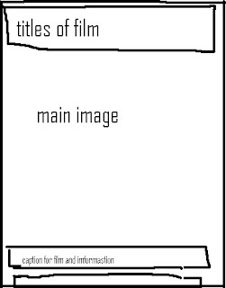
With the film poster it needs to be bold and have the main image and title the first things they read. Theses are the layouts we drew.

(1) (2)


With both of the layouts they have the title,main image and caption but one desgin is diffrent and has actors name. I feel that desgin 1 is alot more realasitc than the others and also looks more like other Horror film posters that i have seen. Also with desgin two im not sure if having the title at the top will distracte the eye from the main image which should be looked at first.
We decided to go with desgin one as ist simple and has alot of room for the main imag


Magazine Front Cover.
With the front cover desgin there is more work to do done becuase you want the main foucs to be the film though there are other elemnts into it such as pugs,mastehead and selling line. So thinking about how you can make the most of the layout was very diffult but we can up with two diffrent desgins.
(1) (2)


Both theses desgins may look simalire but there very diffrent in the way they will be presents the main image. With desgin 1 There is not much room for the main image as the title,extra infromation and pug are taking that up. And also with the picture we have chosen it is mostly location so we need that top part of the photo to show the audience. This sort of desgin would be great for a womans magazine but not for a film magazine. The other desgin is simple, keeps the foucs on the main image but also gets the imformation needed to the reader. Where the title and mastehead are gives us as much room as possible to show the readers the main image which will give us as much promonatil work. Also the extra's and pugs are moved to the side but are still there and readble.
We decied to us deign two for our magazine front cover.

Wednesday, 10 November 2010

Anazling film trailer


The shrine film poseter doesnt give much away to the audience but the location and a very big hint of the genre. They have left out the age rating,the dates so im guessing this is the poster for the teaser trailer maybe.
With the main feature being the location they have done this very well by keeping the mystry going with the fog maikng the genre more obviouse by it being scary.
The way they have done the title is very clever. It looks like they have taken the french or spanish bible and highlighted the words of the title. This gives us an idication of the story line of the film being around reglion.
I really like the mytrey of the poster and have got an idea to base my film poster of the trailer on the location and to keep it very secreative and not give too much away.

The human centipede film poster has alot more information than the shrine but i feel that its not as mystriouse as it should be for a horror film. The caption 'your flesh is his fansty' and '100% medical accurate' gives the audeince alot to think about and what the storyline is. The sillote is the main feature of the poster and does keep the mystry involved. Wiht my own poster i want to use thw sillote from this poster and the location of the first psoter to conbim them together to get a real good poster.


With this poster the image of using the mushrooms and the full moon in the background to make a skull is very creative and scary. With the font of the title they have made it look as if its jolting around and not quite sacure which gives the audience the feeling of being dizzy and siorted which might have something attached to the film.
Also the words 'get ready to get wasted' gives us another indication of the film having something to do with maybe taking drugs. This poster is very creative and unique with the way they have used the mushrooms to make the skull is really smart.

Film Poster.

The caption to a film poster is very important becuase like the title it can give us an idea of the genre of film and what we are expected the story line to be based on. Theses are are ideas to go with the poster and we wanted it to be quiet hard hitting so 'Death lives here' is perfect for what the film portrays. The other ideas are good just not as good as the first.

caption ideas
  • death lives here
  • insatinae is infectious
  • its our turn to adapt


The title for the film is the most important part of the whole film. The title can give the audeince an idea of the genre and the title can also stick in there memories more than some of the other things like advertising.

film title ideas.
  • The baby
  • The infant
  • The last drive

With theses ideas they had a visable link to the film trailer which gives the audience more chance to remember the film title as they have double the visual reminders. We wanted the title to be bold and stand out on the posters so theses are the fonts we chose to pick from. We ended up going the the 'Nightmare' font as its bold but fitting in with the theme of the woods as it looks like twigs pout together to spell the words out. This font will also be used for the caption.


Tuesday, 9 November 2010

Sound Track for trailer.

The music for any trailer is very important as it can set a sence and also give you a clue into the future of what will happen. This is shown in the way the music builds up and slows down.
With out trailer we wanted very slow music at the start (heartbeat,slow classics music) which sets the film and also builds the tension. then after the turning point of the trailer our rock music will come in over the top. we wanted to be diffrent so instead os using the same scary classical music we would have scary hardcore rock music. this makes the trailer a lot more modern by attracting a teenage audeince which is our target and it gives a diffrent look into the trailer and what the film should be like.
this is an example of what the fast pased part of the trailer will sound like.


Film Trailer SoundTrack.

With this sound track it was perfect for the first part of the trailer as we wanted it to be slow to match with the shots. While being slow the child chimes and the wind blowing through the air really goes with our film shots and the mise en scen we wanted to create.


Friday, 5 November 2010

Reshoots

This is a list of all the shots that werent so succesfull. We identifed what went wrong and orgazined how do them them again and when.


This is a story board of all the re-shoots that were doing and how to do them. With having them as picture we can see how excatly how we want the shot to look like instead of imagenting it and it also gives us a realistc idea of what it could look like.

1. (See Tables)
With the first shot we relised that wasnt too good was where the car came from round the conor and it wasnt focused properly. So on the 10th we went back and the sulition was to let the camera foucs a little longer before we got the car to drive past.

2.The second shot was very important to the trailer as it captured the actors face as they was curiously looking at what was infront of them and also the looks as if they were being watched. Though when we uploaded the image the car lights were too bright and also the shot was not steady. So the next time we went we took the tri pod and took the shot from a diffrent light and it turned out very well.

3. The attacker was origanlay going to be played by a girl that was in our group but has she left half way through filmimg we had to change it to a boy due to her hair being in the shot. Also again the camra wasnt steady so we changed the character's sex and also used a tripod.

4. This shot was to relavel the actresses dissappering by the fading the car lights on and off. Though when we done this the camera couldnt foucs everytime the car ligths came back on . Also we could see the acotrs running in and out so again we re-shot in a dark place and gave the caerma time to foucs before back on filming.

5. We wanted to make the shots more realtic and as the actors werent professional we couldnt get the shot of the gilrs being dragged alone the floor. The first problem was that you could see the attackers hands which wasnt what we wanted as it wasnt keeping to the mystry. We shot again for a second time and it still work so After watching the fottage we decied not to put the scene in at all

6. The last re-shot to do was the hazard lights as this is an import scene to show trouble in a diffrent way so this needed to be included. It was one of the easiest shots to do and went well on the day.

After the re-shots the editing was alot easier to cut and put together due to the smooth steady shots.

Thursday, 4 November 2010

Filming scedual.

Before we went out to do out filming we wanted to make sure we secdualed and organised everything we needed incuding props,makeup and also what filming we done and where.

Friday 19th October.

Team: Leanne,jade,charlotte, me.
Actors: leanne,jade,charlotte.
Props: Car's,Pram,lighting.
Loacation: Bread and Cheese lane
What we would film: Film the first part of the trailer getting reday for the bulid up.

The film session went really well and we got alot of the shots that we needed to do. It was quiet hard getting the shots we wanted with the lighting as there not none except the headlights from the car's but it went really well.


Sunday 21st October

team: me,leanne,jade - charlottle left the course half way through filmimg so we had to do alot without her which left us behind the sedual that we planned.
Actors: Leanne,jade and conor replacing charlottle.
props: car.
Location: Bread and cheese lane,woods.
What we filmed: We filmed the last part of the trailer which hopefully should make the audeince want to come see the fast pasted film.

The second filming session went alot better than the first as we knew how to use the camera better, what shots looked better with the actors and also we knew what the we wanted to shots to portray.
with charlottle gone it was alot harder to have only one person filming as the other two in the group were actors but we worked through it and the shots looked really nice.


Target Audience.


My target audience is around 15-25 as this is a very popular age to watch horror films with friends and boyfriendor girlfriend. The film is aimed at an audicnce who like fast pasted films that keep you on the edge on your seat. The horror is a realistic horror as it uses real people insideadof monstors,ghost and paranormer as suposded to fake horror such as saw. Films like this wouldnt happen everyday so our fiulm is based on scaring people with real life issues.

My target audience is for people like Flo. Flo likes the thrills in her life such as rollercoasters and partying and high lflying sports. She is a very socail girl and could say was the leader of her group of friends and the type of person would go to the cinema and choose the film. So I want to trailer to stand out to both boys and girls like flo who are looking for something on the edge of there seats.
hopfully with a mysteriouse film trailer and poster it will attract the target audience like flo who will want there to be a sequence.