Film poster.
With the film poster it needs to be bold and have the main image and title the first things they read. Theses are the layouts we drew.
(1) (2)

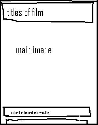
With both of the layouts they have the title,main image and caption but one desgin is diffrent and has actors name. I feel that desgin 1 is alot more realasitc than the others and also looks more like other Horror film posters that i have seen. Also with desgin two im not sure if having the title at the top will distracte the eye from the main image which should be looked at first.
We decided to go with desgin one as ist simple and has alot of room for the main imag
Magazine Front Cover.
With the front cover desgin there is more work to do done becuase you want the main foucs to be the film though there are other elemnts into it such as pugs,mastehead and selling line. So thinking about how you can make the most of the layout was very diffult but we can up with two diffrent desgins.
(1) (2)


Both theses desgins may look simalire but there very diffrent in the way they will be presents the main image. With desgin 1 There is not much room for the main image as the title,extra infromation and pug are taking that up. And also with the picture we have chosen it is mostly location so we need that top part of the photo to show the audience. This sort of desgin would be great for a womans magazine but not for a film magazine. The other desgin is simple, keeps the foucs on the main image but also gets the imformation needed to the reader. Where the title and mastehead are gives us as much room as possible to show the readers the main image which will give us as much promonatil work. Also the extra's and pugs are moved to the side but are still there and readble.
We decied to us deign two for our magazine front cover.
No comments:
Post a Comment